Open Mon - Fri 09:00 - 17:00 Email us info@spirito.gr Call now +30 2410 252121
Spirito Group Rebranding
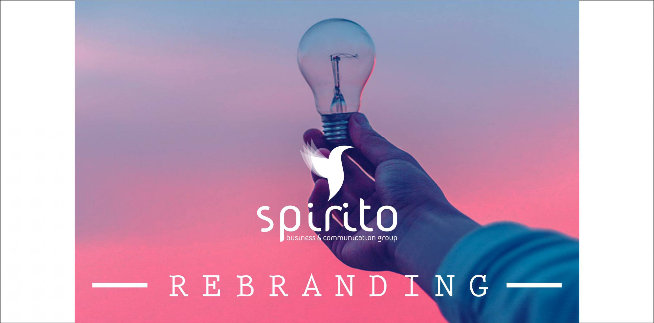
After a successful course of 12 years in the field of Marketing and Communication, Spirito Group redefines its identity and re-introduces itself to the public with its new identity.
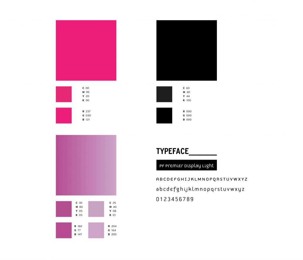
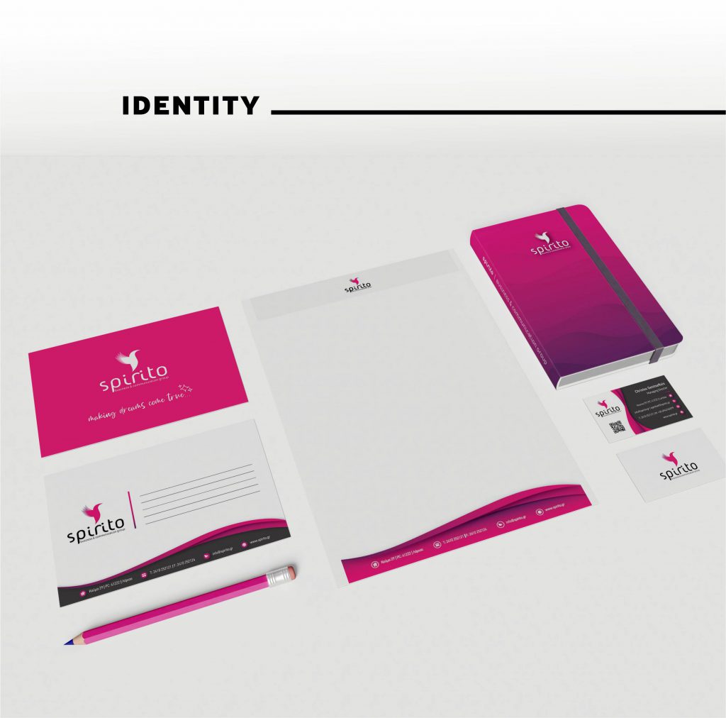
Paying special attention to the design elements, we proceeded to create the visual symbolism of the logo and the shaping of its style. Our goal is to highlight the special elements that characterize the company over time, through the shapes, the letters, the color palette and the binding of all of them.
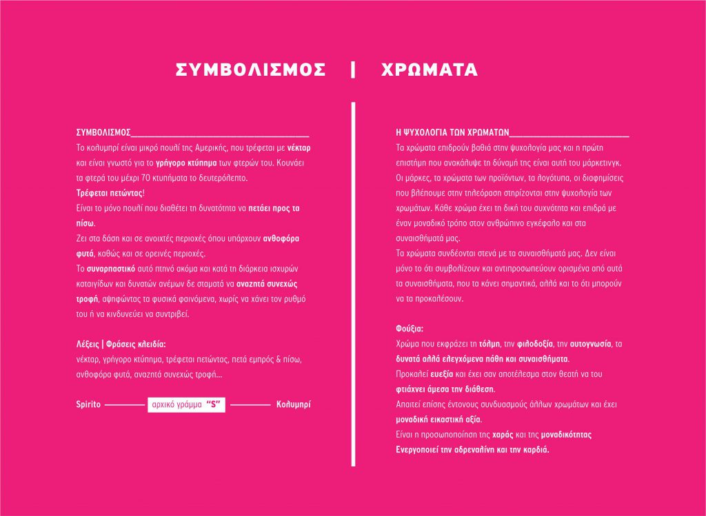
- Energy, Extroversion, Optimism, Capacity
- Courage, Ambition, Perseverance, Determination
- Speed, Flexibility
- Creativity
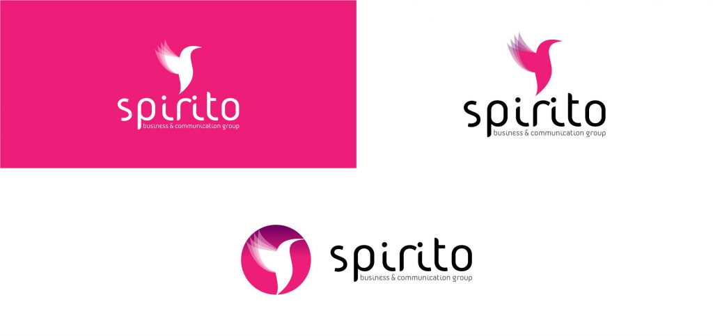
The use of the initial letter “S” as the main design symbol was combined with the shape of the hummingbird to capture and visualize the new identity of the company.
Our goal is the result in terms of design and message level to emphasize the authenticity and uniqueness of the company, to be an effective channel of communication with the public and to inspire!